 IMAGE COMICS: What does the "symmetry" of the title refer to?
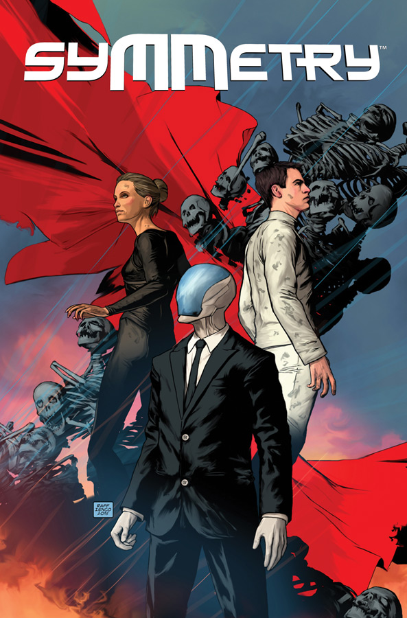
RAFFAELE IENCO: It refers to a lot of things. There are two sides to every story. Two worlds, similar but different. Black and white. Order and chaos. Balance. Harmony. Also interesting to note is that history goes through cycles and that a finished cycle or circle also has symmetry.
MATT HAWKINS: When I was trying to come up with a title for this, I originally called it Utopia. When I ran the trademark search, the new TV series popped up so I had to change it.
In nature, all animals are attracted to symmetry. We're attracted to symmetrical features in faces. It's what most people find attractive. There's a lot of symmetry in nature and we associate it with beauty. Architects and engineers tend to make things symmetrical, and when we see cars or buildings that aren't symmetrical our minds tell us that these things are wrong. In this story, the world is meant to seem perfect and symmetrical, but it's far from that.
IC: How did you two connect on this series? How long has the gestation period been since you started work on it?
MH: Raff did an original graphic novel called MANIFESTATIONS that we published digitally a few years ago. I met him through his manager Josh Morris. I was familiar with his work on EPIC KILL and some of his Marvel work. He also has done a series called MECHANISM that we'll be putting out later this year that he wrote and drew, which we've been talking about for a few years. When I had everything lined up with SYMMETRY I reached out to him right away, as he was my first and only choice on this. Not sure what I'd have done if he said no!
The time between coming up with the initial treatment to working directly with him was very quick, much faster than something like I did with POSTAL, which was years in development.
RI: My manager is good friends with Matt, and he and I had been talking of doing something with Matt for a while. I had just finished a project and was looking to jump on something new, and Matt had the idea for what was to become SYMMETRY ready to go. Matt sent me an outline of the project and I began to come up with concept art immediately. Two weeks later or so, Matt presented some of the concept art at San Diego Comic-Con 2015 and announced the project. And five months after that it was a printed first issue. So it was really a fast ride from idea to printed comic. And the partnership and collaboration has been working really well!
IC: Raffaele, you're handling everything but the letters and writing on this one. Can you break down your process for us? Are you doing a traditional pencils-inks-colors progression, or something else entirely?
RI: So, this is a new look for me, a new style which I'm still formulating, really. I'm able to use color much more liberally now. Almost all the artwork is done digitally in Photoshop, starting with black line work, then adding color, and then merging the two. I start with thumbnails drawn by hand on paper and then redraw the scene with improvements onto the computer screen, adding elements and references, and coordinating the colors in different layers. Using a few Photoshop filters to try to give it a painterly look. Using "dust" and "fog" to create depth.
 IC: I see a lot of pinkish-purples and deep blues in the art. How did you decide on the visual palette for SYMMETRY?
RI: My color technique is not that complicated. Night time needs a blue hue and its related color palette and daytime has a more yellow-red palette. Blue is a more serene color and it fits with a Utopian feel. I just generally go with what looks good and the computer lets me see a wide range of color choices before I decide. I don't have a complex master plan for the art. I regularly look at the artwork of my fav artist Bill Sienkiewicz for inspiration (Elektra Assassin and his Jimmy Hendrix bio GN are masterpieces).
IC: Are you looking to anything, whether specifically or generally, for inspiration on this series? How did you go about designing a utopia on the verge of if not decline, at least massive change?
RI: Believe it or not I was inspired by an old episode of the original Star Trek from the '60s—"Let That Be Your Last Battlefield", which starred Frank Gorshin as one of only two survivors of a doomed race. Both characters were black on one side and white on the other, but were mirror images of each other. Their hate was so profound because of such a little thing as being black on the right side instead of the left that it left an impression on me all these years. So the costumes and a few other things in SYMMETRY received an influence from that.
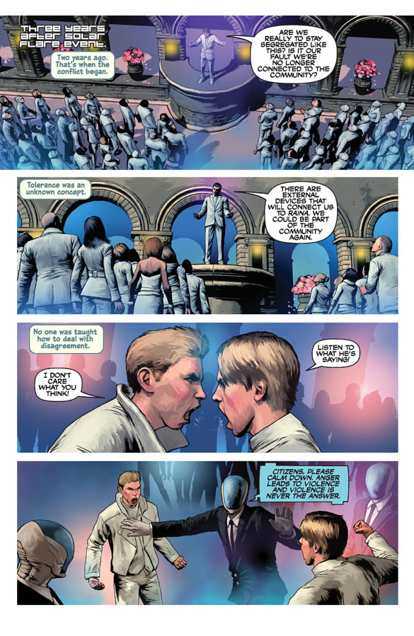
The design of the world was based on my observation that movies that portray the future are always overreaching the actual amount of change the world will have. For example, we are currently living in the time of Blade Runner, but the world itself currently still looks very similar to the time when the movie was first made. My look for SYMMETRY shows some technology, but it's embedded mainly in a world that could pass for today. I think the reader accepts the world more that way. The real change is in people's outlook on life, their relationships and their mindsets.
IC: Matt, you mention that you've read a lot of dystopian fiction, and this book is partly a reaction to or inversion of that kind of story. What do you get out of breaking down a utopia like this?
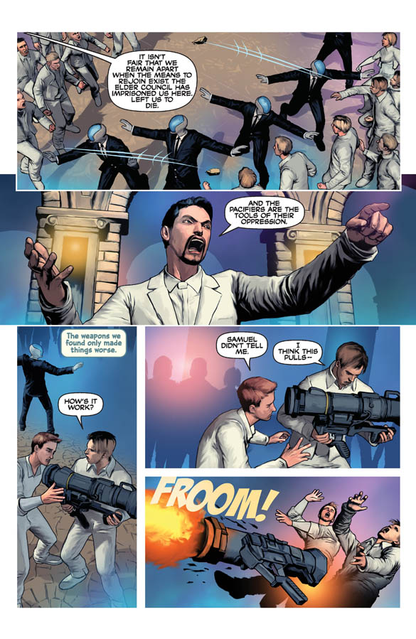
MH: That I failed entirely! I wanted to do an anti-dystopian story, but it's really a dystopian story cloaked in a false utopian one. There's a lot of YA dystopian fiction out there and a lot of it (in my opinion) is not great. I wanted to do something a little different. There's also so much out there about AI and robots taking over, killing us all, et cetera, and most of that is based on nothing but wild speculation and people trying to market fiction. I've talked to some scientists who are leaders in the field of AI research and they are much more hopeful about the future.
IC: The Welcome to Sociology backpages shed light on your academic research for the series. Do you focus on pop culture when researching works like this as well?
MH: I'm fascinated by human nature and why we do things. Perception is also a lot of fun and these things are very prevalent in pop culture. I prefer the academic research as it gives me source material that is slightly different from what everyone else is focusing on. So the answer is yes and no. It's very obvious to me when I read a comic book and I can tell that the writer only reads comics for the most part. The research is my favorite part, actually. I always tell people to write what you want to know. It makes the research and the breaking down of the plot and ideas behind it far more fun. I believe in the iceberg theory of world building. You have to know all of it, but only show 10% of it, otherwise you bog down the story explaining everything and the characters get lost.
IC: How married are you to the research you do before beginning a project like this? If you come up with a good scene or bit that's contradicted by real life, do you figure out how to make it fit or fudge the math, so to speak?
MH: I've done both. Since this is fiction, I try to make it as realistic as possible given the research, but I will sacrifice that in the name of the characterization or moving the story forward. Ultimately, if it's reasonably plausible, readers seem to be very forgiving. I will often explain when I fudge something in the pages after the story and people seem to like that. Between the "Science Class"-type back matter pages I do in all my books and social media I'm fairly transparent on the process.
SYMMETRY #1 and SYMMETRY #2 are both available now. SYMMETRY #3 arrives 2/17.