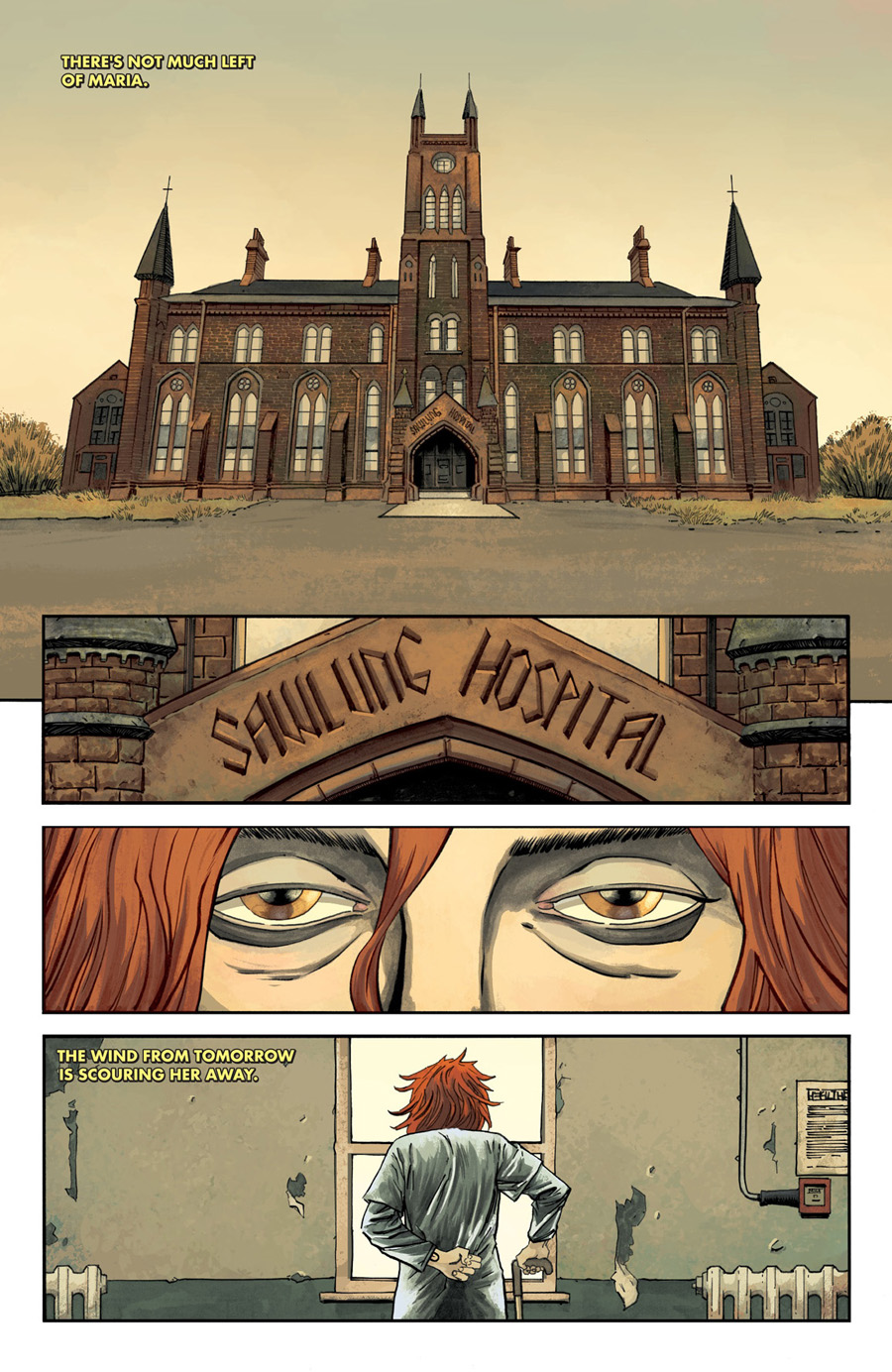
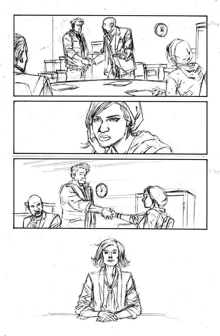
IMAGE COMICS: Declan, you mentioned drawing this hospital on-stage at New york Comic-Con 2015. It's the first page of INJECTION, our introduction to Maria, and also a statement of intent: "This is what INJECTION feels like." Can you break down your process behind this page, especially what went into constructing the building? Jordie, did you come into this series with a firm idea of what the palette and coloring style would be, or did it take a lot of discussion?
DECLAN SHALVEY: Well, Warren Ellis and I share a fondness for Wes Anderson films. I remember specifically talking about the poster for The Grand Budapest Hotel and how the cover was just the front of the building. We didn't discuss opening the book with a similar image, but I'm pretty sure that approach was stuck in my mind, and was how I wanted to open it. We had discussed Anderson's use of composition and symmetry, and it's something I wanted to explore.
With the opening page, I wanted to straight away establish the tone, pace, and mood of the book. Still. Rich. Ordered. Each panel has a central composition that frames it specifically, yet also deliberately leads your eye down the page. As for the hospital itself, I did a lot of reserach for old mental institutions and unused hospitals in the UK until I found one that I thought really worked. I tweaked it a bit, changed some features, etc., to make it work in the composition and also look more imposing.
JORDIE BELLAIRE: I feel like at the time, I was watching Gone Girl like—every day. Or had Gone Girl not come out yet? Either way, David Fincher was a huge inspiration for me always. I like getting to play with these sickly greens. I knew I wanted to work with Declan's washes more too, and I started using more painterly brushes with his work. I think we had the usual discussion between artist and colorist focusing on things like colors of settings or costumes...but ultimately, Declan allows me a lot of creative freedom. I know he loves the painterly texture stuff I do, like the floors having strokes or the walls being spackled with texture brushes. I think the more of that he sees, the happier he'll be!
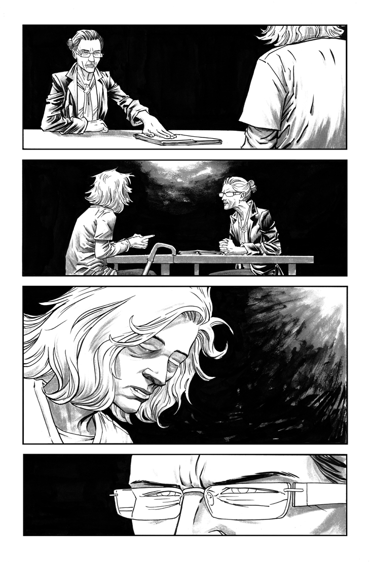
IC: This page is a really good example of colorist-as-storyteller. The deep shadows and Maria's bright red hair say a lot about the mood of the series. Jordie, what's on your mind when coloring a scene like this?
JB: Declan had known that he would want to see this scene lit harshly in a brighter white light. We wanted to make sure Maria's hair definitely popped. Her hair is really lovely and we get to play it up with different settings all the time. I wish I could take credit for the design and intensity, the tone of this page—but really, Declan nailed it with his stark use of black and excellent cropping of Maria.
IC: I'm curious about the intersection between line and color art on this page. The lighter tones and loose backgrounds imply a hazy flashback. How do you two work together to get this effect?
DS: With the flashback sequences, I wanted to differentiate between those scenes and the current-day ones. You may not be able to notice, but the current-day scenes are all rendered in greytones that Jordie beautifully colours. With the flashbacks, I wanted them to be more restrained, not as rich and textured. After that, I pretty much left it up to Jordie to play with the sequences as much as she liked...
In general, Jordie and I will have a conversation about colours I was thinking about. She'll take it on board, but if she decides it's not working and goes in a different direction, 95% of the time I'll go with it. I trust her instincts as a storyteller.
JB: I knew we wanted this to look different but I didn't want it to feel like a conventional flashback scene. Flashback scenes can be pretty dull and I think colorists have really exhausted most of the interesting avenues one can take in regards to keeping a flashback unique. In my mind and as the story has continued, I like the idea that the flashbacks are very much like memories. I like the idea that a memory is never completely reliable. In the flashback here, everything is faded and the background details are fuzzy. They weren't important at the time of the flashback and they aren't important now.
You'll find that in the newer arc we're doing with Vivek as the lead, all of the backgrounds are not hazy—just black and white. It's like Vivek can remember what happened completely but the details just aren't part the focus of his memory. Also, in Vivek's flashbacks, everything he has encountered/experienced is in full color. Warren has written him as very detail-oriented and intelligent, so I would imagine his experiences are fresh in his mind, always.

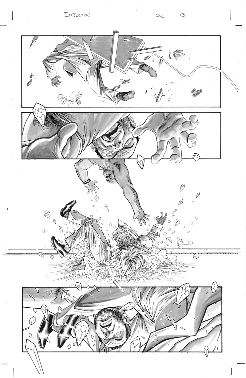
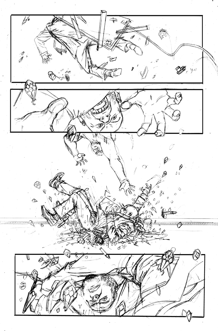
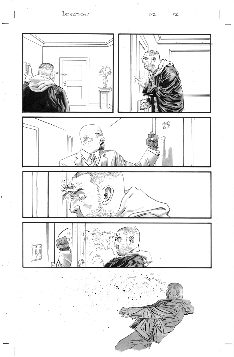
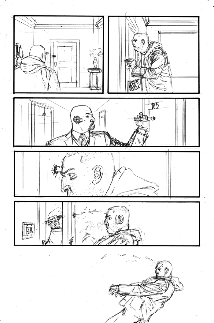
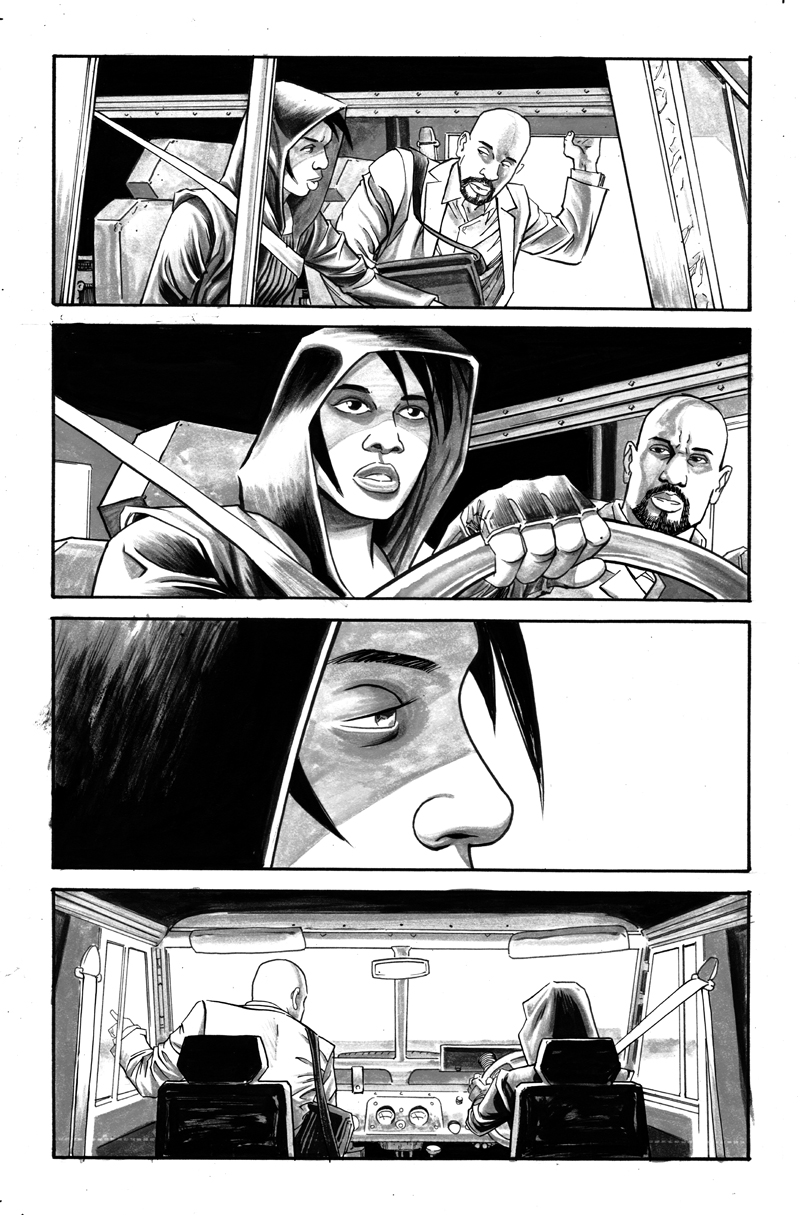
IC: An upside-down fight scene. Where did this idea come from, and how hard was it to execute?
DS: This was an idea of Warren's and it's a scene that gave me the idea for that issue's cover. I think Warren wanted to do a fight sequence, but make it a bit more visually interesting by putting the reader in Sim's position. You see a similar trick in films sometimes, a character is spun but instead we see the environment spin. Of course, in comics we don't literally move the environment, so we need to use different tricks. Since everything is upside-down, I think the reader's eye is forced to move up; my job was to move you down, to move you from one panel to the other against your better instincts. I think that created a sense of distortion without taking you out of the story. I achieved that by taking objects in the environment and using them to break the panel border, to naturally move your eye to the next panel.
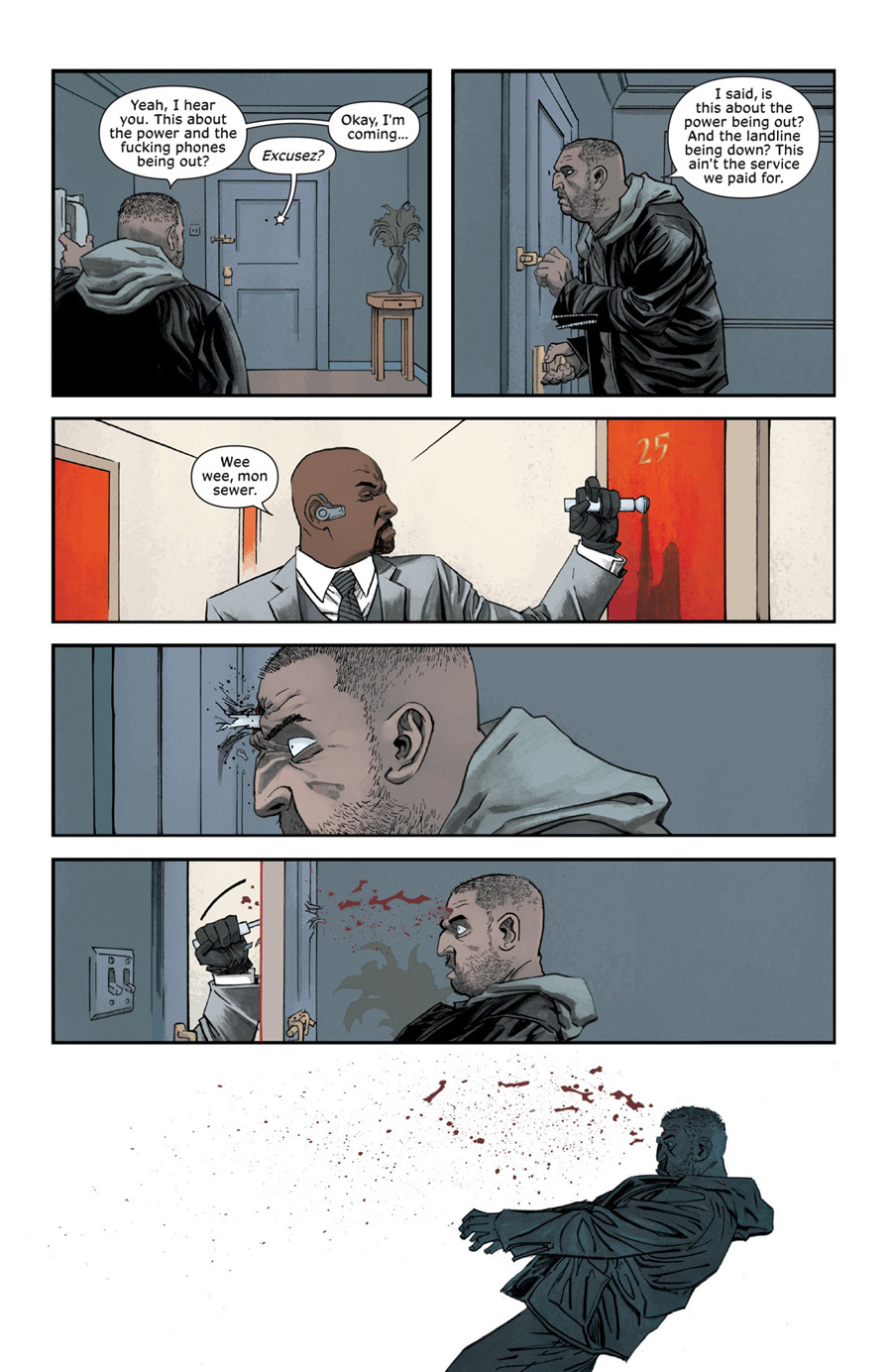
IC: What's your approach to violence in this series, in terms of both depicting the act and rendering the gore? How much is too much?
DS: I'm not much of a gore-fan, but I do find violence fun to draw. So much of INJECTION is restrained, so I feel the need to give violence IMPACT. I think violence should be violent, not necessarily gory. For example, I don't think this is a necessarily gory scene, perhaps the most repulsive moment is when the bar penetrates the man's head. It's a surreal image more than a grotesque one. I think it was less violent in the pencils, but I knocked it up a notch when inking the page. In the following panels, there is some blood for sure, but it's used mainly as a compositional element, to lead the reader's eye from left to right.
JB: I'll just say the ending of this particular scene really grossed me out but we really warn people with that red door! Red door means shit is gonna get real. That is like, a narrative color device RULE.

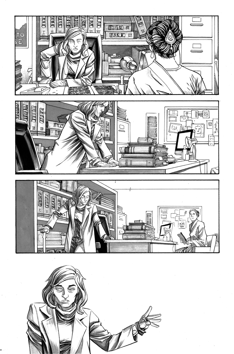

IC: The final panel here has no background or panel borders. How do you gauge when is the right time to just drop a character in a sea of white versus leaving her "in the room," so to speak?
DS: I tend to drop backgrounds for whitespace when I'm trying to hammer home an emotional moment. I think white is a criminally underused colour in comics, so I like to use it whenever I can. In this panel, I did want to remind the reader of Maria's loneliness, but there were also economical reasons. The previous panels all show the background behind Maria: the chair, the bookshelf, and the various books. I felt that I had filled the rest of the page with enough information that the reader's eye needed a place to rest. And frankly, I could do with having a less time-intensive panel. So, it was a mix of storytelling reasons and economic reasons to end the page on that note.
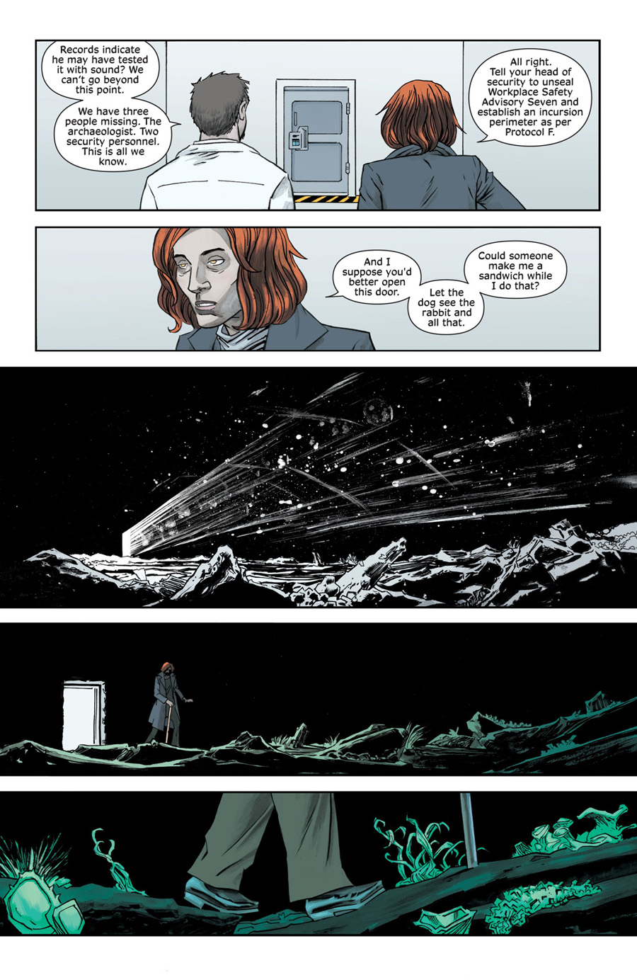
IC: The lighting on this page is striking to me, but the backgrounds in panels two through four stand out, too. What kind of communication is going on with you two when constructing a page like this? Am I correct in assuming that Jordie painted the backgrounds, or did Declan sketch in a guide for them?
DS: I washed in a horizon line for the final panel background; I didn't want to clog up the window shapes with line art. When Jordie was colouring though, she got pretty into it and came up with some beautiful results. I probably wouldn't be comfortable with another colourist making obtrusive moves like that, but I learned long ago to let Jordie follow her instincts; it leads to more exciting and interesting places.
JB: It isn't always my first instinct to do things like this but when Declan gives me an open scene with open windows and no real direction other than "It's night time"—sometimes I go a little nuts. I think it's all subtle enough that it didn't bother Declan too much. It wasn't intrusive to the art or story and the flashes of color easily fit with the palette and motion of the scene. It's small embellishments like this that keep Declan sweet!
IC: Can you walk us through your cover design process? The covers for INJECTION are very "design-y." Declan, are you discussing or thinking about color as you lay them out? Jordie, how soon do you come into the process?
DS: Well, first: thanks! I really do want my covers to be design-y, i.e., having a design-heavy approach to an illustration. With the INJECTION covers in general, I try and make them the opposite of what I do with work-for-hire covers. INJECTION covers aren't really supposed to POP right out at the reader. I want them to be more subtle, to attract the reader's eye and lure them in, rather than belt them over the head. It's more a question of atmosphere that I try to portray.
With this cover in particular, I wanted to spotlight Robin Morel. I decided to take a scene from the book and use it to spotlight Rob, but also show us some element of danger/suspense. Also, I wanted to try a composition that an editor at a mainstream company would probably never approve. I shoved Rob right up into the top corner, obscuring his face, and the rest of the image is all negative space. I'm not reinventing the wheel or anything, but when I came up with the composition it just "clicked."
JB: This is actually my least favorite cover of the series—maybe it's because I didn't get to play with color as much as I like? I really struggled with many of the first arc covers. I was over-thinking everything and taking the concept much too seriously. I think because so many of our other covers with other publishers are so "poppy" and "graphic" I thought it would be good to keep all of these covers with "real" colors. In doing that, I ended up feeling like I was repeating myself from the interiors to the cover—it's not my jam. That said, I feel much better about the covers we're doing for the second arc. I've found my sea legs now.
Also in the second arc, and like most of our covers at other publishers, I get a lot of input from layouts to finals. Declan is extremely receptive of any new idea I have. We discuss cool concepts for the cover. Sometimes he has an idea and he needs no input from me but I'll throw out something cool we can do with color and that lights his fire. This first arc of covers was definitely more Declan doing pieces he felt proud of. He's really happy with them and he seems to like the colors too! Once we got to the Roth cover, issue four, I really felt things heading in the right direction, collaboratively. I had a lot of input about the time of day and I suggested the stars. With the Vivek cover, issue five, I had seen Declan drawing it and mentioned I'd drop in red (we had just finished watching the Daredevil Netflix series) and that felt like magic after it was finished. One of my favorite covers we've ever done together.

INJECTION is available in a collected edition and ongoing single issues. INJECTION #8 is on-sale 3/16.