Brazilian artist Eduardo Ferigato describes his process—from photo reference to thumbnails to shading—on his electric comic with writer Mat Groom, Self/Made.
Self/Made traverses a rich expanse of fantasy and sci-fi intrigue, realized with precision by Brazilian artist Eduardo Ferigato. The mind-bending new series— written by Mat Groom, colored by Marcelo Costa, lettered by Troy Peteri, and edited by Kyle Higgins—weaves between worlds and genres. It first presents the fantasy realm of Arcadia before venturing to far more diverse environments that... we won't spoil here. Fortunately, the second issue of Self/Made debuted yesterday, deepening the cast and mystery as a lone warrior named Amala Citali meets her very unexpected maker.
Ferigato utilizes a clean, crisp style with contrasting shadow and light to assemble environments that range from sand-swept kingdoms to cosmic sci-fi expanses. The following feature walks through his digital process for rendering this ambitious narrative.
Eduardo Ferigato on the Making of Self/Made
My process usually starts with thumbnails—the only moment when I draw on paper. I like to study the pages in a small scale, this way I can really make the composition and narrative work. So I start by doing one layout and, after that, continue to draw more ideas until I'm satisfied. One thing that I've learned over the years is not to be lazy in pushing the page to a better look. That's where the small sizes of the thumbnails help. Since it only takes minutes to draw them, I don't mind discarding whole scenes to make them look better in the end.
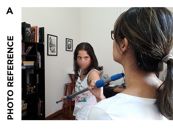
Most pages come out without reference, but sometimes I get stuck, or the drawing is too difficult to do by memory. Thats when I go out looking for references or use me and my family as models… lol.

My layouts are very clean. I like to work that way. I leave the detail part to the inking and also like to leave the backgrounds more loose—almost out of focus. My storytelling is more cinematic, since I worked too long with storyboards for publicity and movies.
I like to detail the most important part of the scene, where I want the reader to look, and leave the rest more loose in a way that doesn't call much attention to the eye.
After I finish the "inks" (all my work is digital), I sometimes like to mark some light and shadow areas to reinforce where I want the focus point of each panel. But also, sometimes, I leave that work to my wonderful colorist, Marcelo Costa, who is also great in doing that, and in picking the right color palette for each sequence.
Page 1, Issue #1
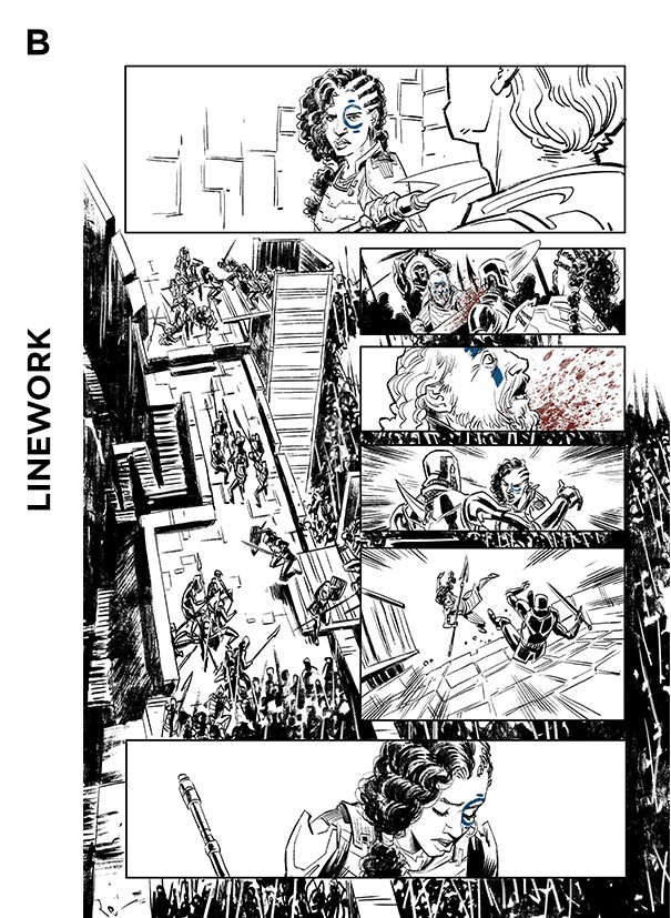
This page from issue one was a lot of fun. I really wanted to give an epic battle scale to the scenes. In issue one, I decided to go for a very classic fantasy look—the script requires that in order to put the readers in Arcadia and prepare them for the final twist. Also, regarding each army's set of clothes, I gave Amala's people a more human and fragile appearance. They wear leather, whereas the advancing army wears almost pure metal, never showing their faces. The arriving sun behind the army that Marcelo did on colors really gives the final touch to it!


Page 6, Issue #1
For this battle sequence, Marcelo suggested the red-and-yellow palette that really gives a more dramatic feel to it. It was also great to separate the flashback from the actual events on panels one and six. Since we had shown the armies on the initial pages, I could use more close-ups in the battle so the reader could get some blood splashing on their face. Panel one was difficult to make, so I called my wife and daughter to assist me, using a mop as a prop for Amala's blade :)

Cover, Issue #2
Since issue one almost completely takes place in Arcadia's fantasy world, we thought it would be cool to open issue two with a completely new scenario: Amala in her medieval leather clothes, creating a contrast. The cover was originally blue, but to distinguish from the first issue's color palette, we decided on a green/yellow scheme. Once again, after choosing the thumbnail, I requested that my daughter pose for the reference. Somehow, she is a much better model for Amala than me. This super crazy sci-fi world that we see below will only be revealed in issue three!


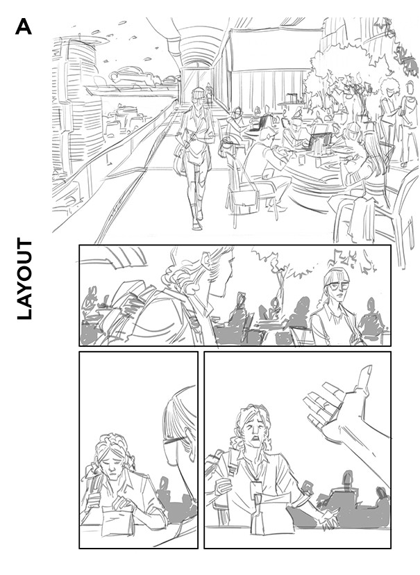
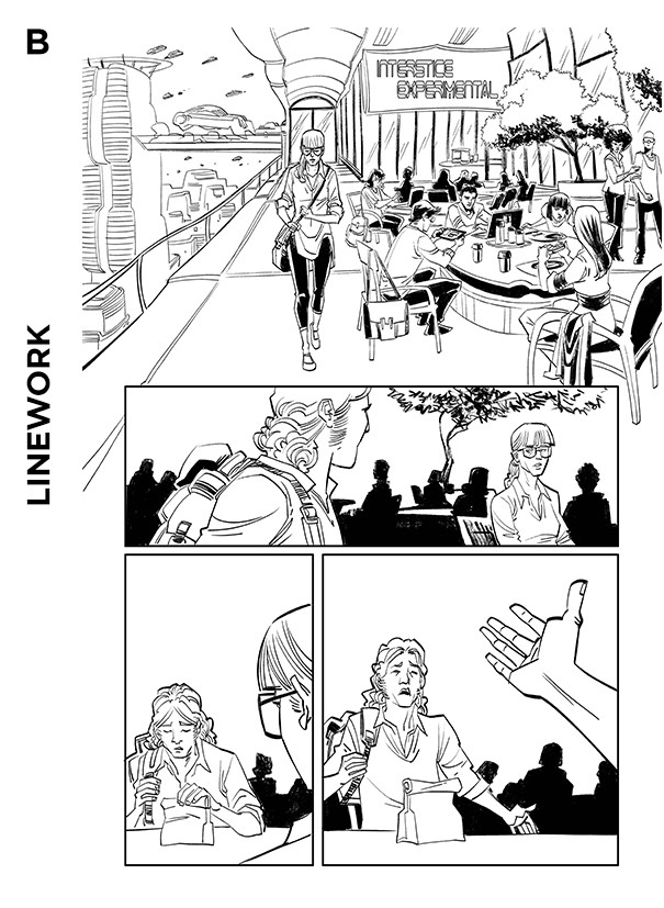
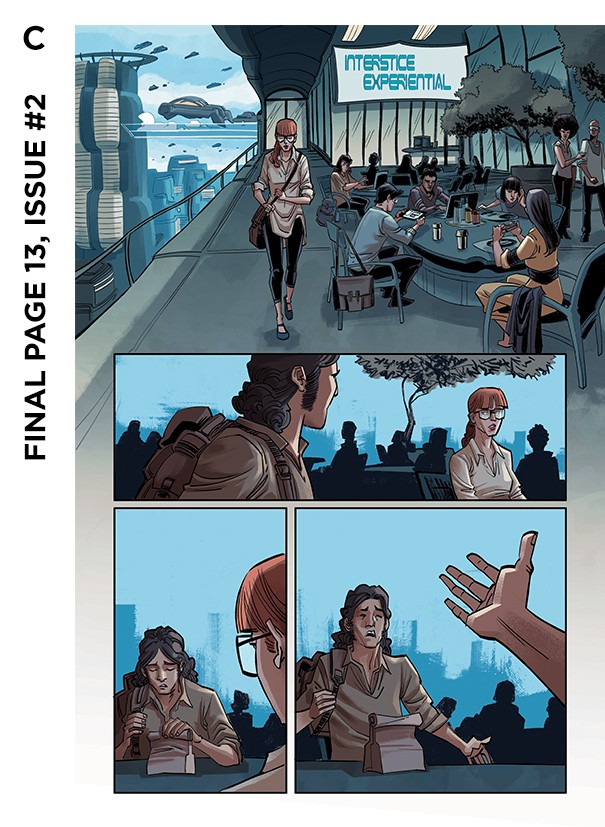
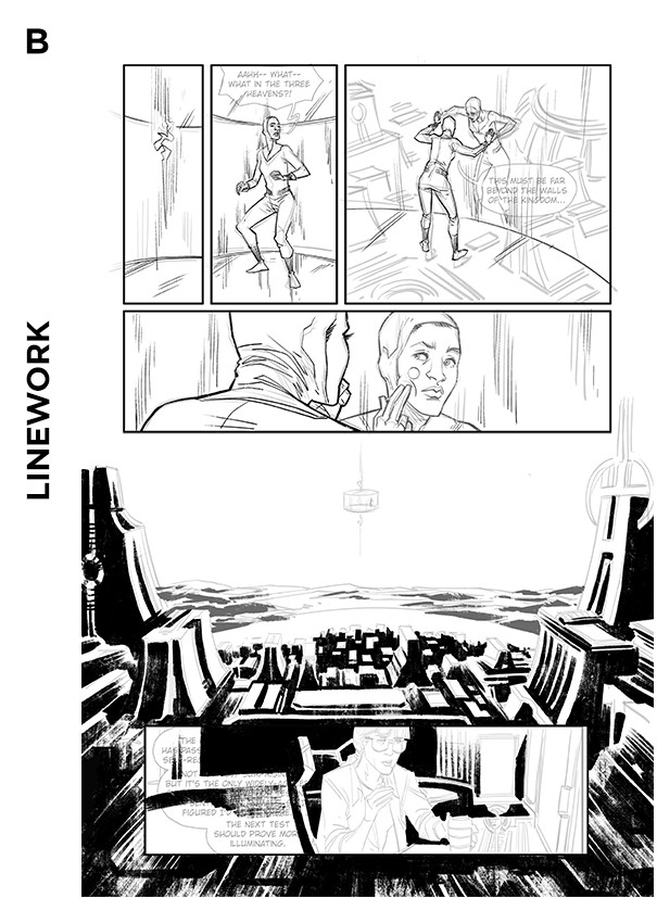
Page 9, Issue #2
Page 13, Issue #2
When we say that Self/Made is an adventure that spawns worlds, we are not kidding—that's a great challenge and also very inspiring, because I get to create fantasy worlds, invisible space rooms, and even start-up offices! And wait until we show what else we have up our sleeves. Issue three was a lot of fun to draw, I can tell you that.

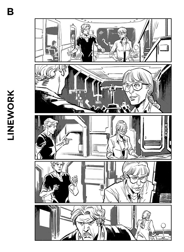

Page 12, Issue #2
The advantage of working in digital is that it speeds up the process a lot. Here's a more detailed step-by-step of my workflow.


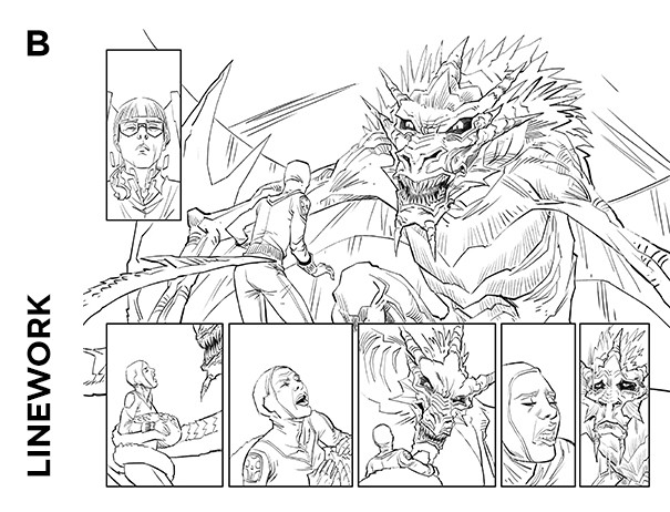
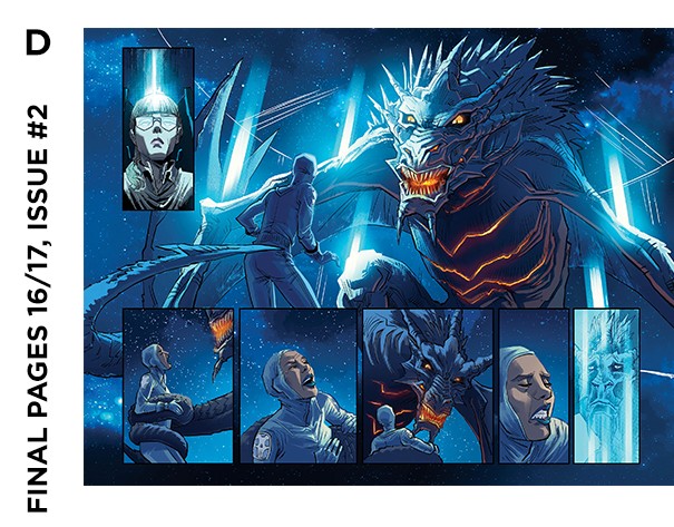
Pages 16/17, Issue #2
When I read in the script that we would show a dragon in space, I immediately tried to put it in a double-page spread. Yes, it's cool to draw dragons :)