
 IMAGE COMICS: You're doing a near-future sci-fi story here, with high-tech imagery, dystopian influences, and even a bit of feudal Japanese influence. What were you looking at while you were designing this future? Were you going for specific influences, or more of a general feel?
SEAN GORDON MURPHY: There's a lot of Blade Runner in there, which is a mix of a thousand different influences from '70s and '80s concept artists and futurists. Sci-fi slums are almost a trope at this point, so I just tossed in a bunch of stuff that readers would be familiar with in order for them to get into the story faster.
IC: This interview is in honor of the B&W edition, but you're working with Matt Hollingsworth on the colored edition of TOKYO GHOST. What was the initial conversation like with Matt when you were defining the world? What mood or effect did you most want to see out of Matt's work?
SM: Matt has developed a "woodblock press" style based on Japanese woodblock prints from decades ago. It's a style that he ONLY uses on me, so I'm really thrilled with that. And with TOKYO GHOST, we finally get to use that Japanese style on a book that takes place in Japan.
The biggest note I gave him for this was for coloring New Los Angeles—I was worried it would get too colorful, so I told him to try and limit the palette to only 3 colors. I don't like when sci-fi looks like an electric rainbow.
IC: The hand-lettered sound effects feel like a hallmark of your style. What led to you first including these little extras in the story? Why do you like the effect they have on your work?
SM: I started using them on a book called Off Road I wrote and drew back in 2003. I didn't know how to use computer SFX (and lettering), so I did it all by hand. I continue to use it today if I have a specific placement idea—like a "CRASH!" SFX being behind a crashing car—it's easier to draw in there than explain it to the letterer. Plus, it's easier to sell art with hand lettering/SFX on them.
But for the other half of the needed SFX, I'm happy to let the letterer do his/her thing.
IC: Your pages are remarkably dense and complex, with screentone, deep blacks, symmetrical wavy lines...what's your overall creative process like? Do you plan pages in detail in the thumbnail stage, or work things out on the page?
SM: I plan loose thumbnails based on clear storytelling and where I want to place the black shapes. I'd say it's 80% planned, then 20% improv on the page when I'm messing around with inks. A lot of the detail in my pages is just noodling around with the nib and brush—organized nonsense that a reader will interpret as detail.
IC: TOKYO GHOST is visually layered, too, especially in the first issue. How do you balance your artwork and the dense clouds of screens surrounding Led Dent? Do you add them in post, or specifically plan them in the pencilling stage?
SM: The first issue was the hardest issue I'd ever drawn, and those floating screens didn't help. I put most of them on a separate layer, but I found that it got too jumbled once it was all flattened in colors. For issue two, I drew the screen onto the same page as the artwork so it wouldn't overlap the background and cause chaos. If I could redo issue 1, I would. But you live and you learn. :)
(preview from color edition)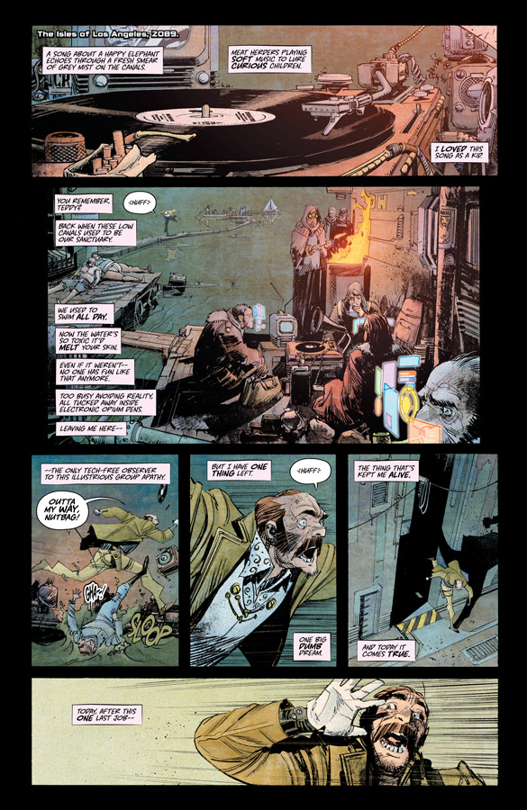
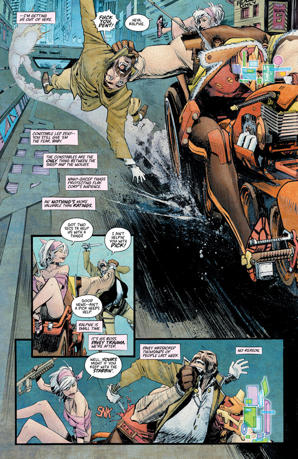

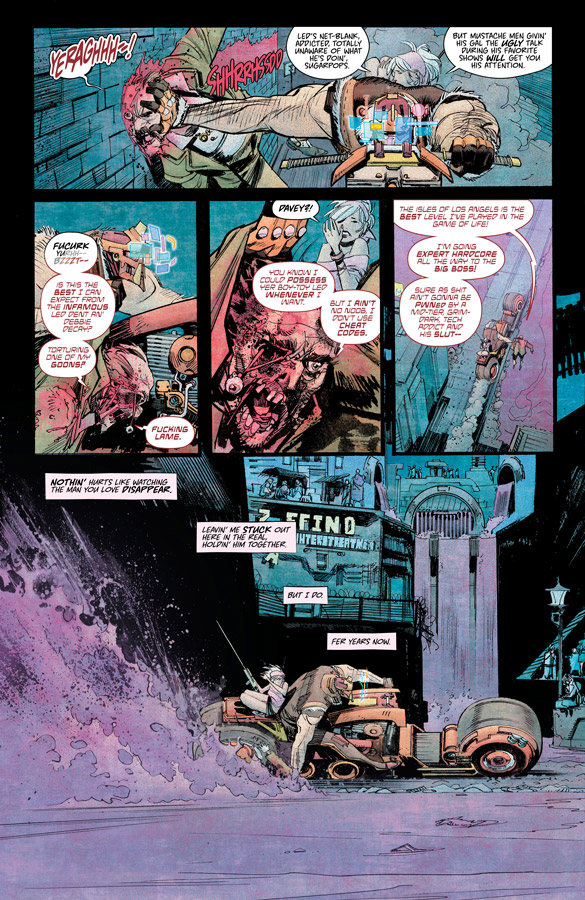
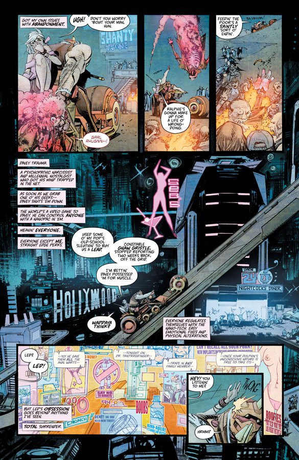
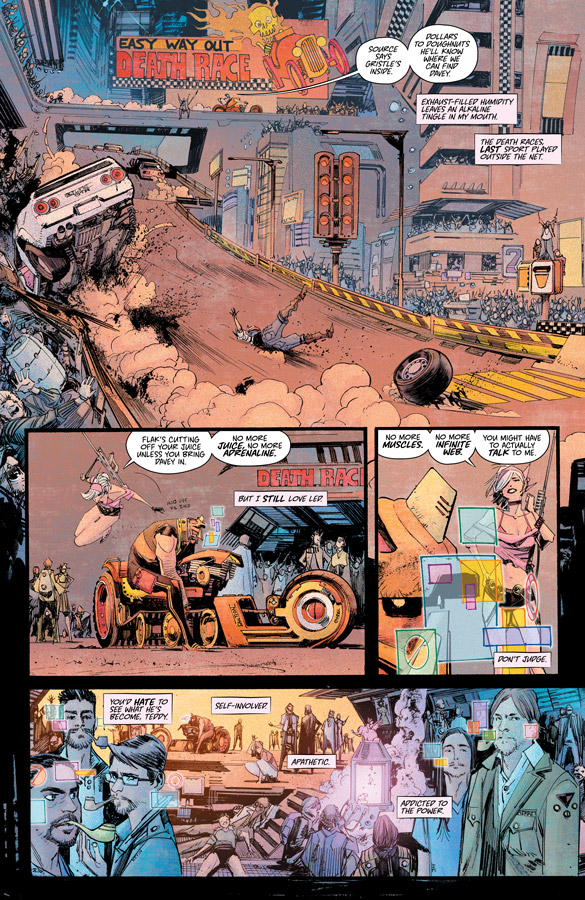
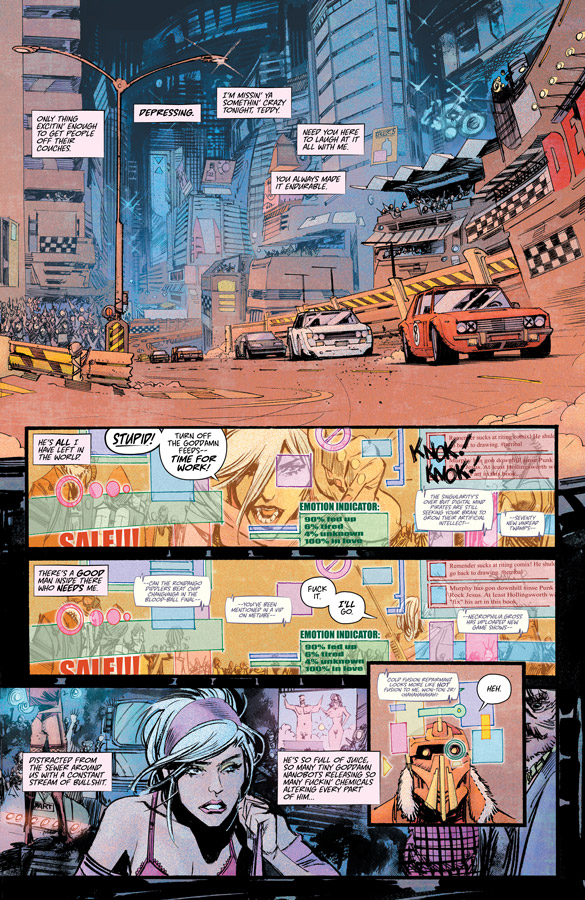
IMAGE GIANT-SIZED ARTIST’S PROOF EDITION: TOKYO GHOST #1 & 2 is available now. TOKYO GHOST, VOL.1: ATOMIC GARDEN, collecting TOKYO GHOST #1-5, arrives 3/9. TOKYO GHOST #6, the first issue of the new story arc, arrives 4/13 and is available for pre-order now.