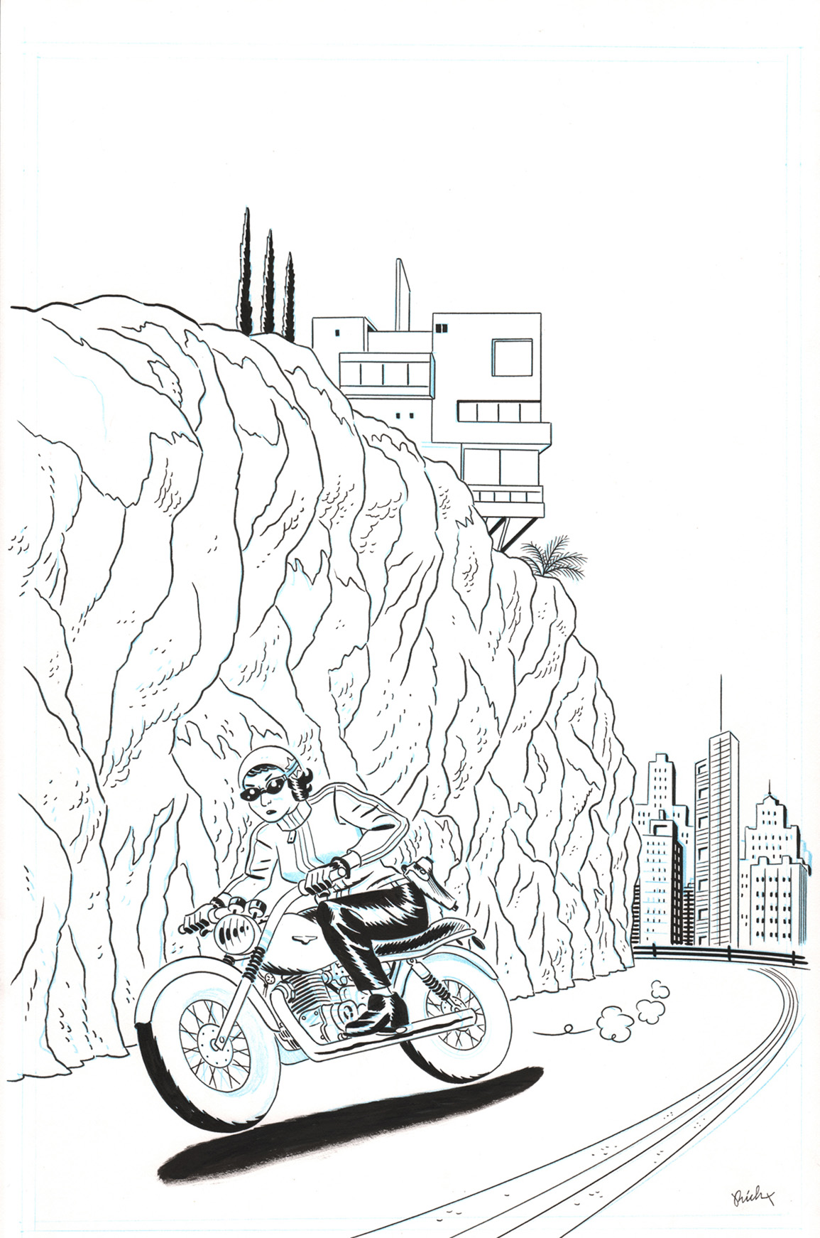

IMAGE COMICS: Let's talk about the technique you used on this cover, because I don't think I've seen many like it this year. Is it fair to assume you drew it normally, and colored the lines to give it that laser-etching effect? What's this style called?
RICH TOMMASO: This cover drove me nuts. You're right, I drew it normally—as a "positive" black and white piece. My plan was to make a Hergé-like cover—a simple illustration using a palette of florid, yet natural, colors. BAD plan. When I first colored it all in, it just immediately looked flat, drab, and boring to me. I tried all kinds of alternate routes with the thing—filling the cover with lettering, coloring everything with darker tones, the 1940s approach: using only primary colors, etc., etc., etc...
Eventually, I decided on the reverse or "negative" idea. But, my work was still far from over. Everything in the negative didn't look quite right either. So, I later came up with the plan of removing Marie and her motorcycle from the backdrop and leaving those items as a positive. After doing that, I noticed that she looked like she was moving very slowly on that bike—also, there was still TOO MUCH black everywhere—and that, if I could show her floating above the road, we'd feel the speed of the motorcycle. So—I inverted the road back to a positive again and drew a shadow on the road for full-velocity. At that point, finally, I had a cover I could live with. Hardest cover design in my 20 years of making comics!
As far as the name for it, I don't know, but it probably has the word "electric" in it. What I liked was that it reminded me of 1970s black-light posters. Which was perfect, because the comic had a retro-1970s design throughout.

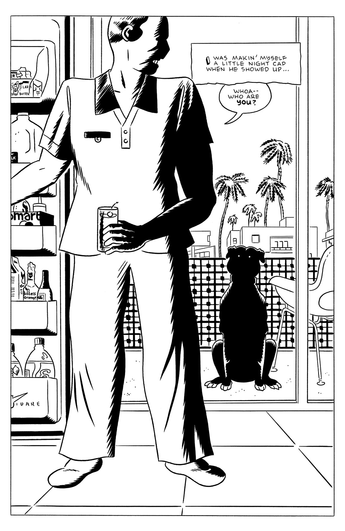
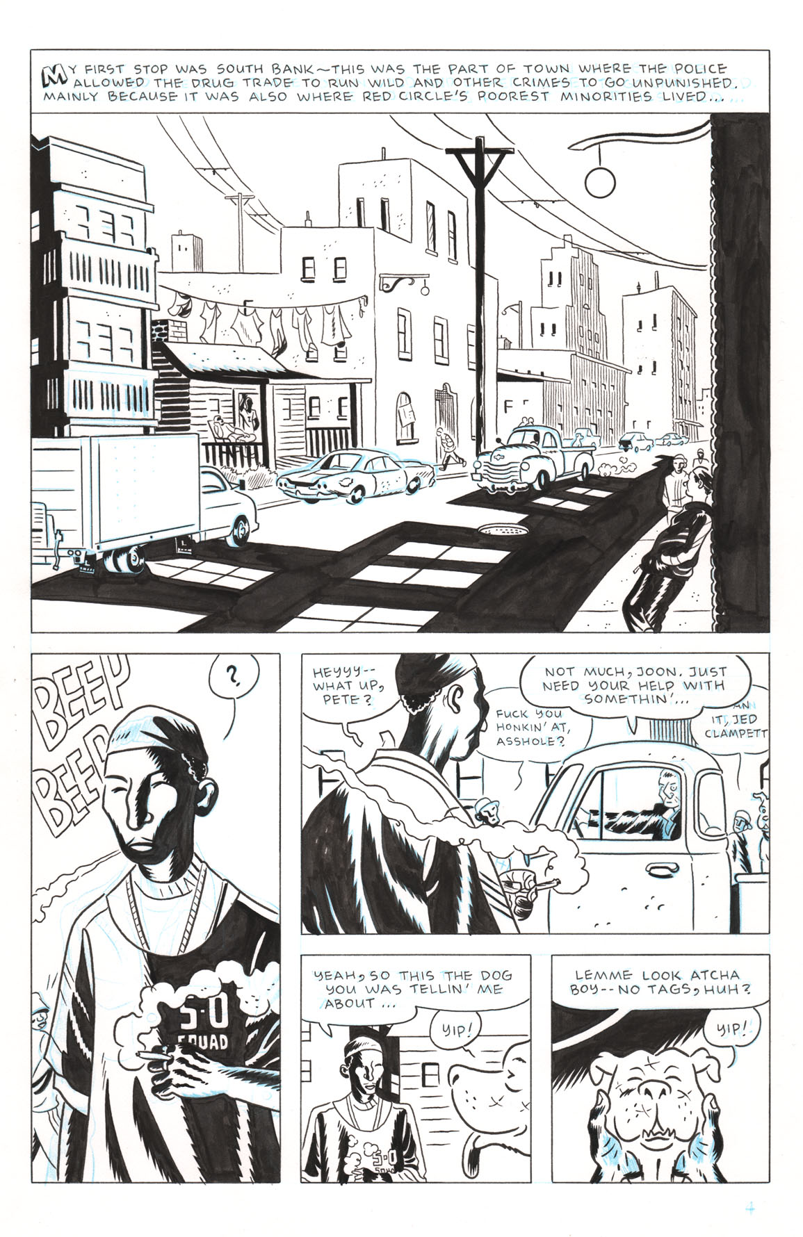
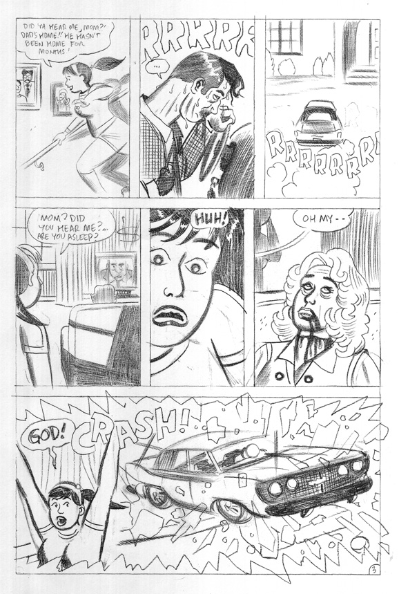
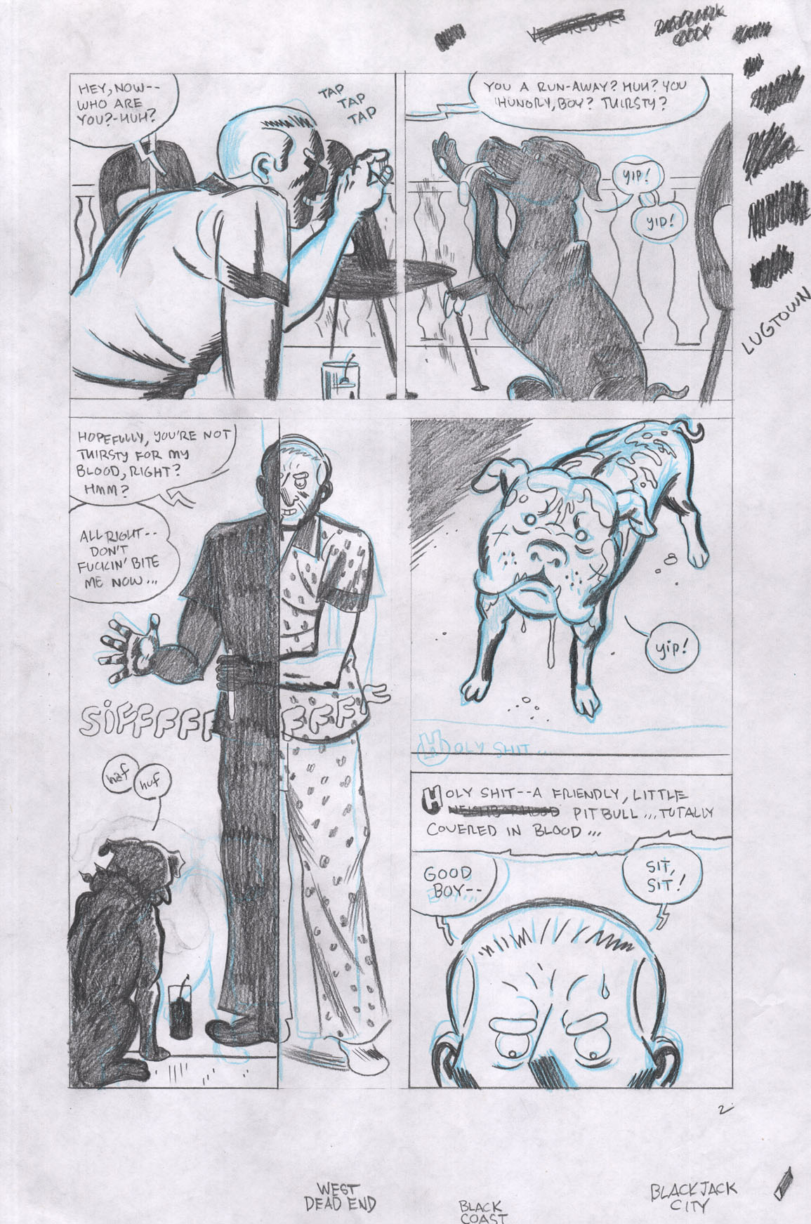
IC: This first page establishes a lot about DARK CORRIDOR, from the climate to the style and beyond. It sounds basic, but what made this the right image to open on? Why'd you go for a splash page instead of a series of panels, too?
RT: It had the character who'd be our main protagonist and who would be in the middle of all the carnage going on in the city—so that was the one thing. Another thing was that it had the ominous black dog at his door, which worked as a foreshadowing of things to come, especially taking into account just who that dog ended up leading him to. But it also made me think of an older man who looks like he's retired—I mean, he's literally "retiring" for the evening too, as he's got his pajamas on and he's lazily fixing himself a night cap. He looks like a guy who doesn't want any trouble in his life anymore. So, yeah, for a combination of reasons, I just HAD to make this image the opening of the story.

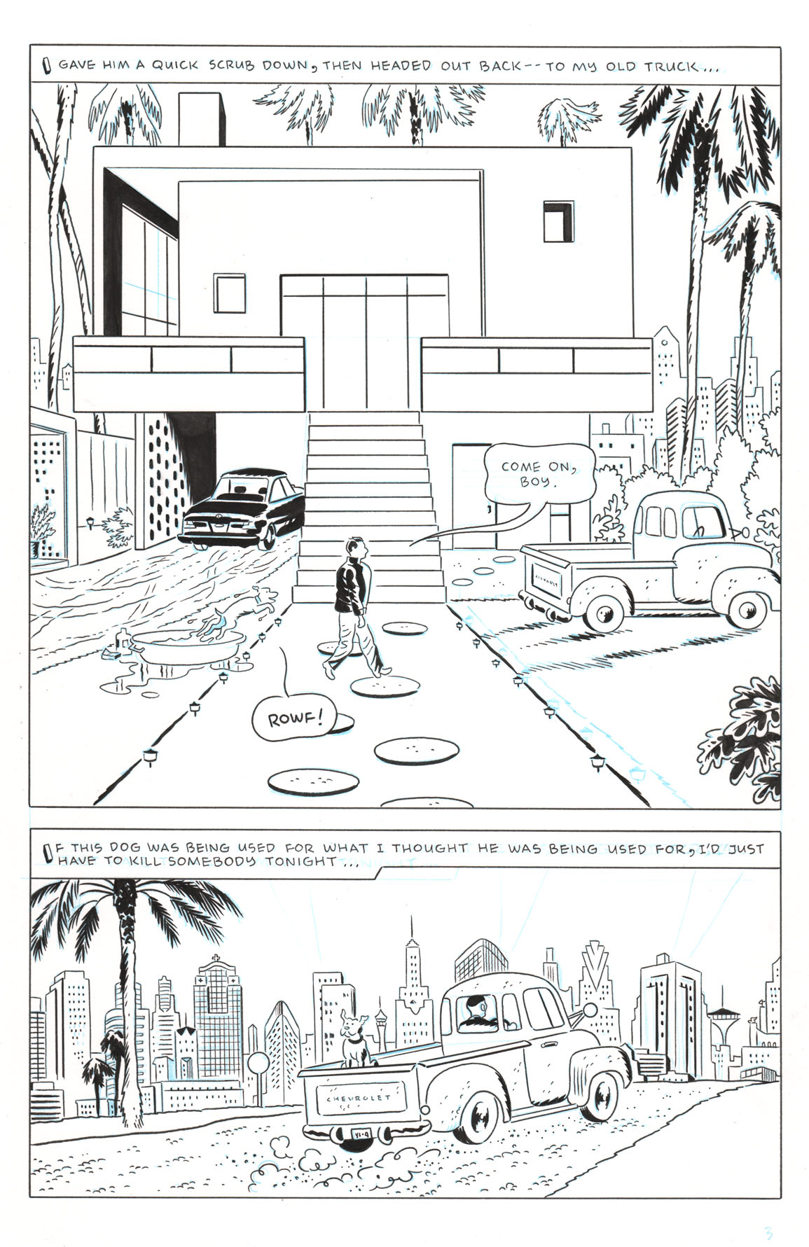
IC: I like that both these panels kinda work as establishing shots. How do you see the city of Red Circle in terms of design? Are you pulling from specific influences?
RT: I've always had a soft spot for Michael Mann's Miami—whether it's Miami Vice the television show or the movie, I love the spots he decides to film in. There's a lot of glitz and glamour, but in some of those television episodes like "Out Where The Buses Don't Run" and "The Maze", he finds some great shot-to-hell slums that you just can't find anywhere else when searching for reference material. I've spent many, many hours in the past, digging through used book store shelves for architecture and landscape photography material on Miami and all I ever found were books filled with the glitz and glamour. So, his films are a big source for Red Circle's design. But, I spent a lot of time in my early twenties down in Miami as well.
1970s California-modern architecture takes over much of the mountainous regions of Red Circle also. For those I mostly scoured the internet to grab and other Californian ranch homes I found in old Playboy magazine spreads.

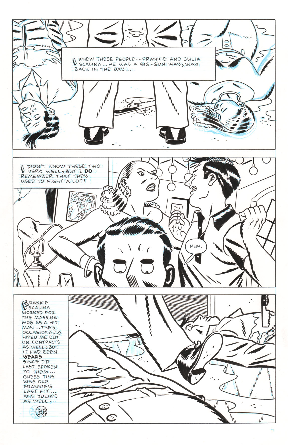
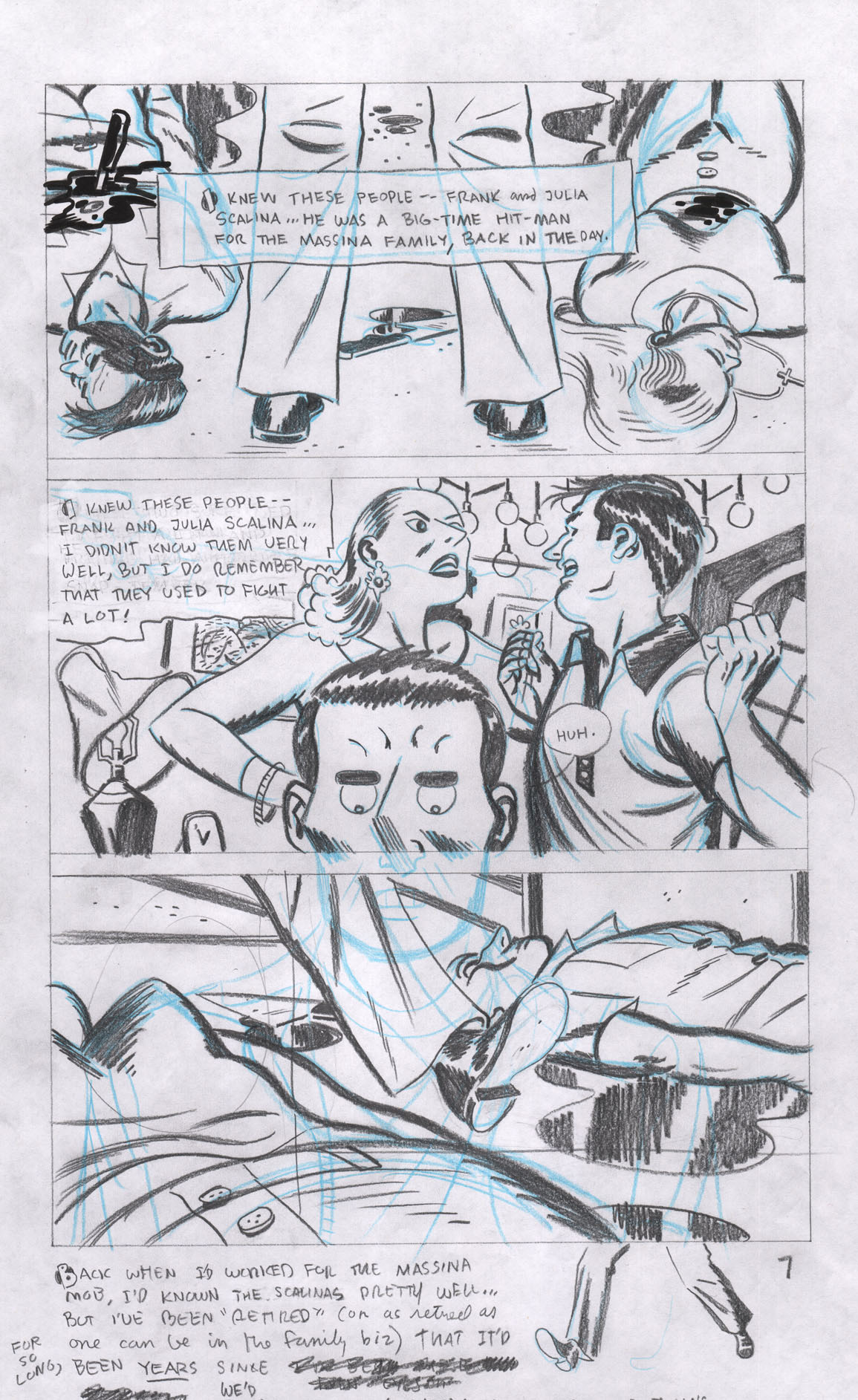
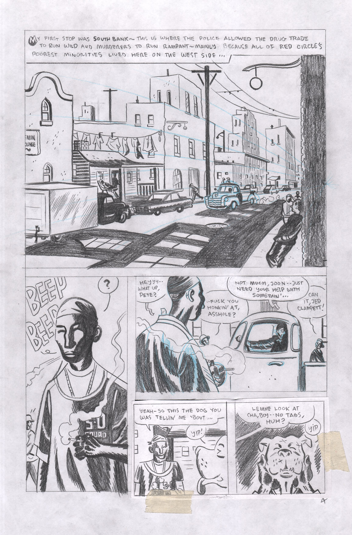
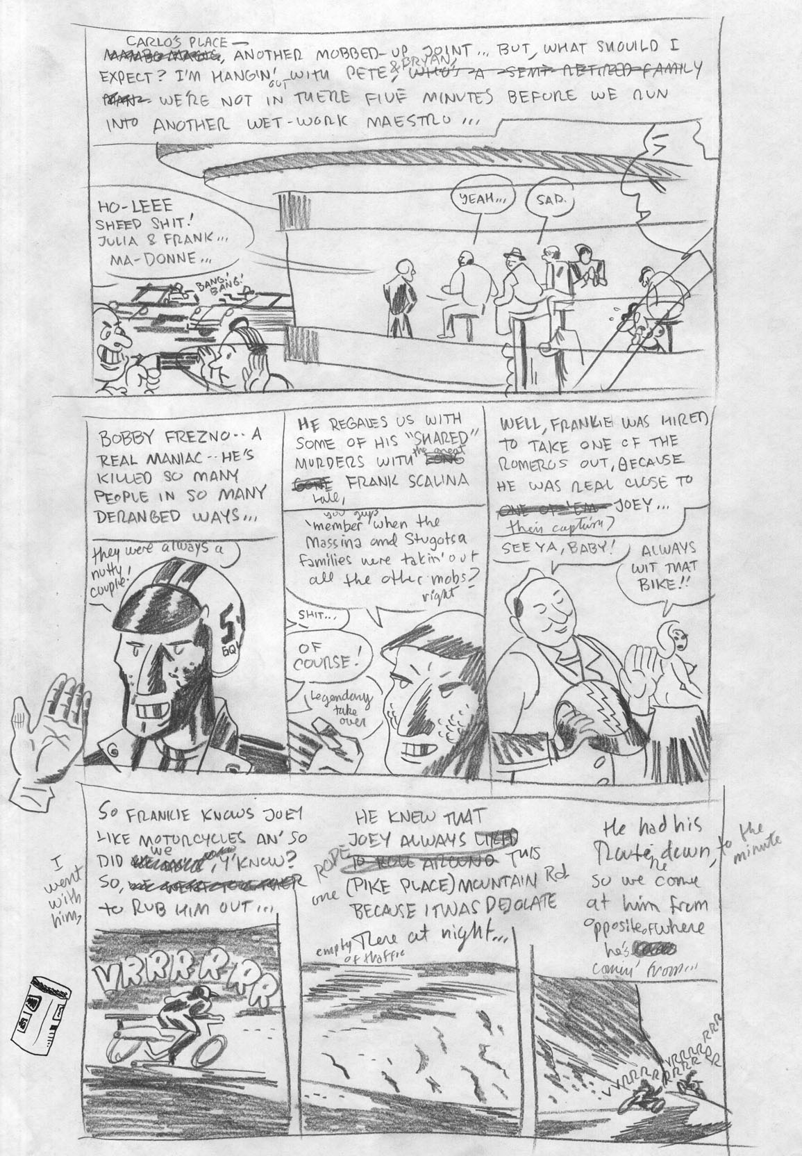
IC: One thing that appeals about DARK CORRIDOR is how much you play with reality, like in panel two. What appeals to you about this approach? How do you balance it with the narrative, so that you don't dip too far into telling rather than showing, or vice versa, as the situation needs?
RT: With this kind of sprawling story, filled with a multitude of characters, I'm always asking myself "just how much do we need to know about ALL of the characters involved?" This couple is like the lighting of the fuse for all the carnage that's to come, but really, we don't need THAT much information about them beyond what their power level was in the family that runs the city and how Pete comes to have known them. So, I was able to kill two birds with one stone here—Pete gets to tell the reader who they are AND we see what role he has working in the same business as theirs too. At the same time we're looking at their death, which was very gruesome and mob-like in nature. This is the sort of thing that I love about doing 24-page comics. In a graphic novel, I could have gone on forever with a scene like this. I could have followed this couple down a long road and at the same time, lead the main focus of the story astray into confusion. A 24-page-at-a-time comic story makes me think of each issue as one little story in and of itself and so, I become way more economical with my time devoted to each scene.


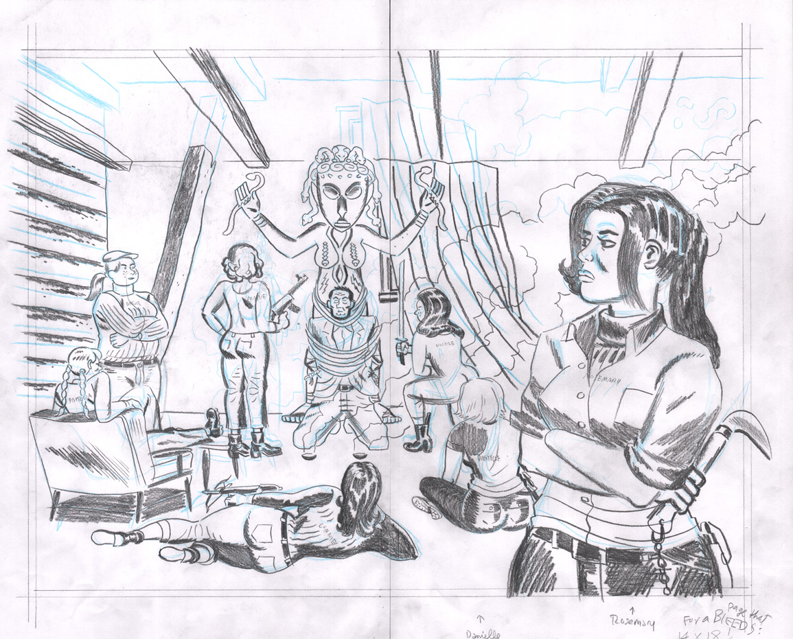
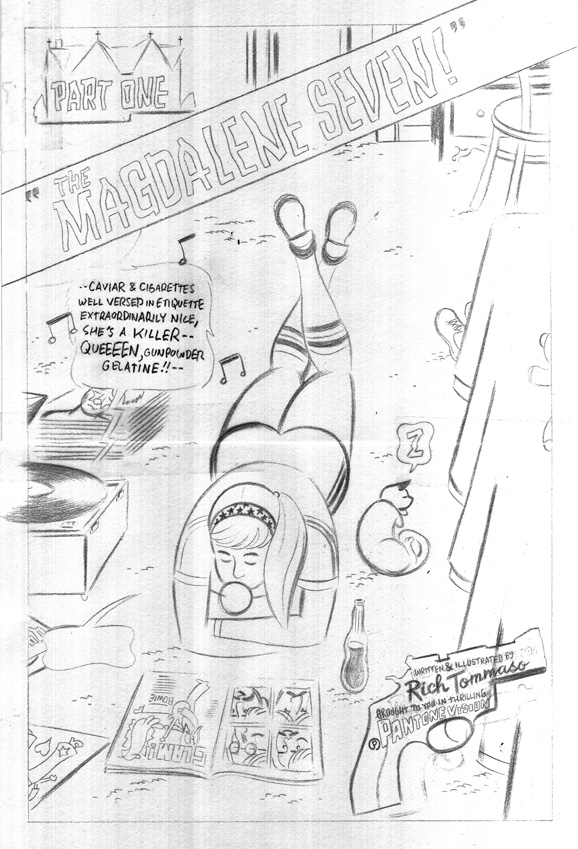
IC: The style and placement of this spread makes it feel like a title card after a cold open on a tv show or movie, and the Daughters are all distinct from their fashion to their weaponry. What inspired this approach?
RT: Most of the Seven Deadly Daughters spreads and story chapters are visually (and somewhat textually) inspired by my massive jpeg file folders of men's magazine stories. I spent a lot of time downloading and staring away at images of paintings by Mort Künstler, Earl Norem, Robert Maguire, Norman Baer, Walter Baumhofer, Norman Saunders, Bruce Minney... If I had had more time, I would've painted those spreads, but I'm a very slow opaque painter, so I had to rely on Photoshop in the end. The Red Circle/Seven Deadly daughters is supposed to read as a hard-nosed, revolutionary, feminist manifesto and I realize that a lot of those old men's magazines are coming from a "ham-fisted", chauvinistic male perspective. However, a bunch of them look like they're just the opposite. Some have women carrying men out of fire fights, men tied-up and carried into dungeons, women swimming through shark-infested waters and carrying men over their shoulders. It's pretty wild—and atypical from the majority of that era of pulp art. I think, ultimately, some of those magazines were possibly marketed to men who wanted to be dominated by tough, firm-handed, adventurous women. But, I could be wrong. It was just another item of those old pulp forms that I could turn on its head to fit my means.

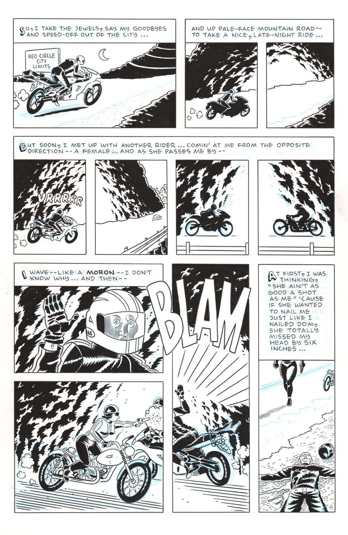
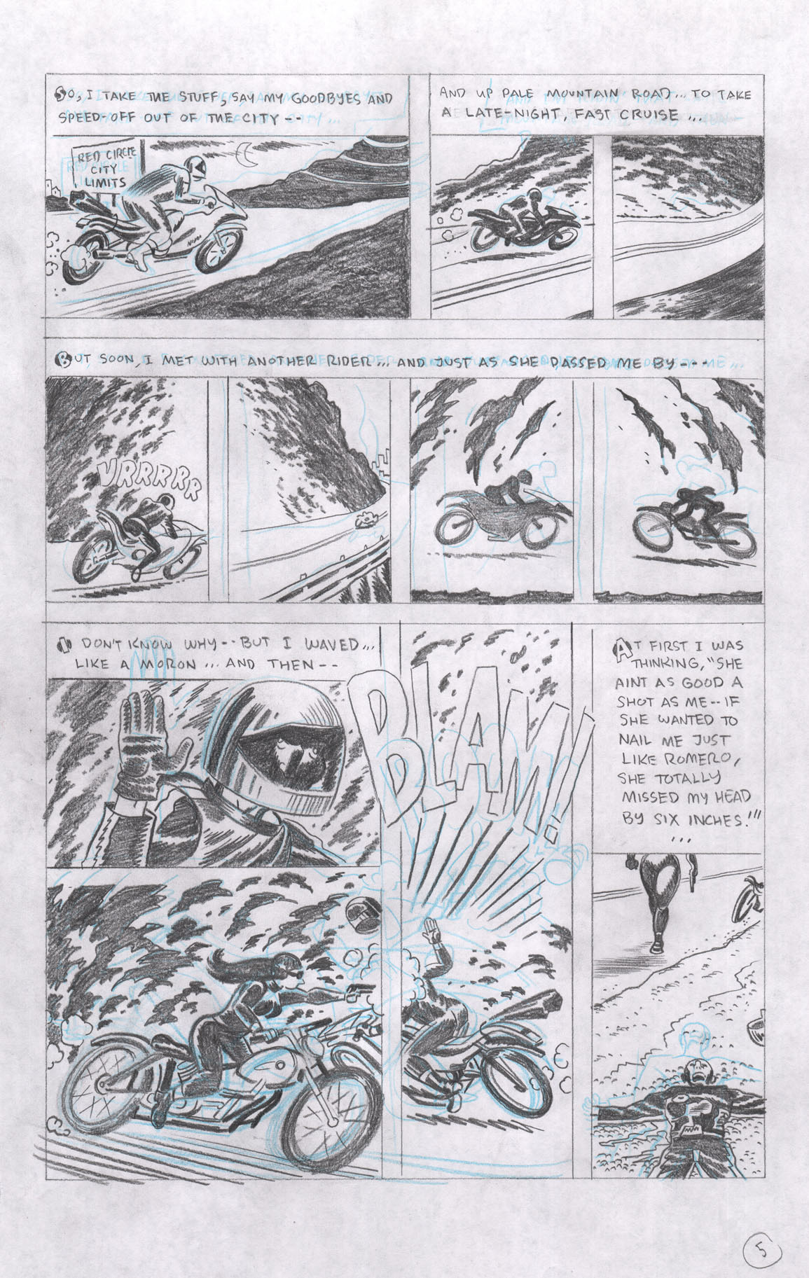
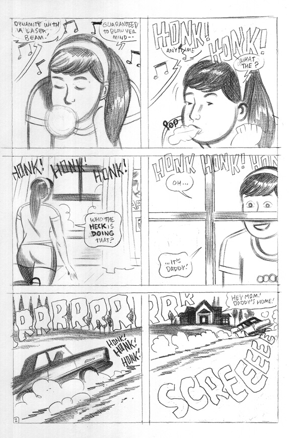
IC: The intersection of art and captions here is fascinating. First, you've got an eleven-panel page, but then certain captions stretch across several moments, while others are contained to just one...how do you go about laying out a page like this? Is it gut instinct after years of practice, or just something you went for on a whim and stuck the landing on?
RT: Everything just worked out the first time I sketched it out on the tracing paper. That was one of those pages where I just somehow knew where everything would land. Some pages I can't envision at all, whereas others I can see entire layouts for in my mind before I even pick up a pencil. Unlike the cover, I got lucky with the page design on that day.